If you've checked out our color temperature overview, you already know that a bulb's Kelvin rating tells you what shade of white light it gives off. Lower numbers mean a warm orange-yellow light, while higher numbers mean a crisp blue-white. That’s the easy part.
It's trickier to decide which Kelvin level is right for your space. That's what we're here to help with, and it's a question we get all the time. For example, the lighting in a restaurant feels very different from a grocery store, even though both use "white" light. That difference comes from color temperature, and it matters more than most people realize—especially if you pick the wrong one.
In short, warmer light helps people relax, while cooler light helps them stay focused. But that doesn’t answer whether your office should use 3500K or 4100K, or if your restaurant might do better with a cooler option than usual. This guide will help you figure that out.
We’ve got a Kelvin filter built into most of our product listings at ShineRetrofits.com, so this decision is easier to act on once you know what you’re looking for. And if you want to talk it through before you buy, our US-based lighting team is available Monday through Friday, 6am to 4pm MST at 1-800-983-1315. They know this stuff cold.
The Scale of Light Color Temperatures
Color temperature is measured in Kelvin (K) on a scale from 1,000 to 10,000. Lower numbers are warmer, more orange and yellow. Higher numbers are cooler, more blue and white. Simple enough.
The part that sometimes confuses people: everything on the scale is technically white light. It’s not like 2700K is yellow light and 5000K is blue light. They’re both white, just white with very different undertones. At 2000K you’ve got a deep amber cast. At 8000K it’s a sharp, noticeably blue-tinted white. Most people are comfortable somewhere in the 2700K to 5000K range, depending on what they’re doing, though that range covers a lot of ground.
A quick note on our color temperature scale: we updated it in November 2016 because the versions floating around online weren’t very accurate. The color representations were exaggerated in ways that don’t reflect how these temperatures actually look in a real room. Our scale is built around what you’d actually see, not an idealized version. You’ll see it referenced on product pages throughout our site.
Kelvin Color Chart
Here’s a helpful fact: the sun at noon is about 5780K. That’s why “neutral white” LED light can look a bit blue compared to the warm glow of old incandescent bulbs. What we think of as daylight is actually cooler on the spectrum, but our eyes are used to it from years of experience.
A standard incandescent household bulb runs 2700K to 3000K, that warmer, slightly yellow light that defined what “indoor lighting” looked like for decades. At the very bottom of the useful range, a candle burns at around 1900K. That deep amber glow is about as warm as most light sources get.
When you see correlated color temperature (CCT) on a product specification sheet, it refers to a metric that measures the color appearance of light emitted by a lamp, expressed as its similarity to the light from an ideal blackbody radiator at a specific temperature, measured in Kelvin. This technical definition provides a more precise assessment than simply describing the light's hue as warm or cool. For instance, a 5000K CCT rating indicates that the fixture's light output closely matches the color of light emitted by a blackbody heated to 5000 Kelvin, using a standardized reference scale. In practical applications, most commercial and residential lighting products are specified within a range of approximately 2000K to 6500K, serving the majority of functional and decorative preferences.
What is Circadian Lighting?
Natural sunlight doesn’t stay the same color all day. Early morning sunlight is warm and soft, low on the Kelvin scale and not very intense. By midday, it’s climbed to around 5780K, which is why noon light feels energizing and crisp. Sunrise and sunset are around 3200K, which is that warm, golden-hour quality people tend to find so appealing.
Our bodies naturally respond to these changes. Cooler, brighter light during the day helps us stay alert, while warmer, dimmer light in the evening tells us it’s time to relax. This pattern has shaped how we feel for generations, even if we don’t always notice it.
Circadian lighting is the design practice of working with that natural rhythm rather than against it. It’s gotten a lot of attention in workplace and healthcare design because the research consistently shows it has a real impact on productivity, mood, and sleep quality. This is the thinking behind most of the recommendations in this guide.
Practically speaking, living rooms and dining areas use warmer light because people are usually in them in the morning and evening, when the body naturally seeks lower-intensity light. Offices use cooler, whiter light because that’s when most productive work happens.
Color Rendering Index
Color temperature refers to the shade of light. The Color Rendering Index (CRI) is about something different. It measures how accurately that light shows the true colors of what it’s hitting, on a scale from 0 to 100, where 100 is a perfect match to natural light.
Low CRI lighting can distort colors. For example, clothes that look good in a store might look different at home. A bright red under high-CRI light can appear dull under low-CRI light. Most spaces need a CRI of at least 80, but in retail, medical, or other places where color matters, aim for 90 or higher.
CRI is less critical in Warehouses, parking structures, and utility spaces. When the primary goals are visibility and security, you can concentrate on other specs and allocate your budget accordingly.
Always consider color temperature and CRI together when evaluating a fixture. Throwlumens and candela into that picture, and you've got a complete view of how the light will actually perform.
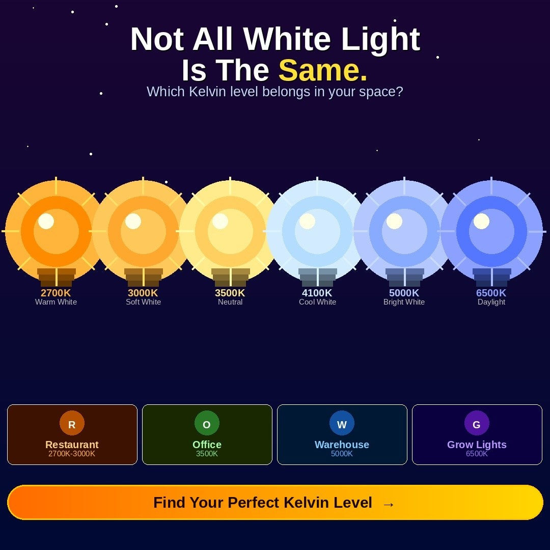
Ranges of Color Temperature & Their Applications
Below is a breakdown of the major color temperature ranges and where each one tends to work well. These aren’t strict rules. There’s always judgment involved, depending on the space, the brand, and what you’re trying to accomplish. A restaurant built around a frozen cocktail concept might actually want 4100K instead of the usual 2700K to sell the theme. That’s a completely legitimate call. What we’re giving you here is a starting point grounded in how people actually experience these light levels. If you want help working through a specific project, give us a call at 1-800-983-1315.
2700K – Warm White – Intimate, Cozy, Personal
Most people know this one even if they’ve never thought about Kelvin ratings. It’s the hue of old incandescent bulbs, warm and slightly yellow, the kind of light that makes a room feel lived in. If relaxation is the point and you’re not asking the light to do precision work, 2700K is usually where you want to land.
Living Rooms
We spend most of our time in the living room in the evening, which is exactly when the body naturally winds down. A 2700K fixture fits that moment. The room feels warm and welcoming in a way that’s genuinely hard to achieve with anything much cooler. If your living room still has bright overhead lighting in the 4000K range, try swapping to 2700K and see how different the space feels at 9pm.
Restaurants
Restaurants have known for years that warmer light creates a more intimate atmosphere and encourages guests to stay longer. Using 2700K with dimmable fixtures lets you lower the lights as the evening progresses. Some places go even warmer, closer to candlelight, for a romantic effect—and it really works. Lighting sets the mood in these spaces.
Hotels
The whole job of a hotel room is to make you feel comfortable and at ease the moment you walk in. Warm color temperatures are a big part of how that happens, not just in guest rooms but in lobbies, bars, and any seating area. 2700K is the hospitality industry standard for a reason. It reads as residential and relaxing rather than institutional.
3000K – Soft White – Warm, Calming
3000K retains most of the warmth of 2700K while adding a little more clarity. You’re still in comfortable, residential-feeling territory, but things are slightly crisper. That makes it a better fit for spaces where you’re actually doing something rather than just sitting back.
Bathrooms
People go both ways on bathroom lighting, and both can work. But there’s a practical argument for 3000K: you actually need to see what you’re doing in a bathroom. Applying makeup, shaving, and checking your teeth before a meeting. 2700K can be too forgiving for that. 3000K is still flattering but gives you enough accuracy to be useful.
Kitchens
Kitchens are a gathering space, sure, but they’re also a workspace where mistakes can be costly. Food safety, sharp knives, hot surfaces. 3000K keeps the warmth of a home environment while providing the visibility you need to cook well.Under-cabinet task lighting at 3000K is worth adding if you don’t already have it. It fills in the shadows cast by overhead fixtures, so the countertop doesn't have to work as hard as it needs to.
3500K – Neutral White – Balanced, Friendly, Inviting
At 3500K, you’re in neutral territory, past warm but not yet clinical. This is where circadian lighting principles push you for daytime work environments. The brain is most alert when light falls in the clear white range, and 3500K sits right at that threshold without tipping into the cool, blue-heavy light that can cause fatigue over a long day.
Worth noting for multi-zone spaces: if you’re mixing color temperatures across several areas, try to keep variations within about 500K of each other. Bigger jumps tend to create a visual clash that people feel, even when they can’t name it.
Office Spaces
3500K is probably the most common spec we see for offices, and it earns that spot. It’s alert without appearing aggressive, and people can actually get through a full workday under it without the light fighting them. A common approach is 3500K overhead lighting throughout the main workspace, with warmer accent lighting in break rooms and lounge areas to give people a mental break from the workday.
Retail Stores
Good retail lighting has to do two things at once: make the space feel inviting and make the product look accurate. 3500K handles both reasonably well. It’s flattering for apparel and jewelry displays while still crisp enough for customers to see true colors. Cooler than this, and the store starts feeling sterile. Warmer, and you start losing color accuracy on the product, which creates problems at the register.
4100K – Cool White – Precise, Clean, Focused
At 4100K, the warmth is gone. This is functional, work-focused light, the color temperature that dominated commercial fluorescent fixtures for years.LED options have caught up completely and now offer the same color temperature with significantly better efficiency. If you’re still running fluorescents,our breakdown of T5 vs T8 vs T12 tubes is worth a read before you decide what to replace them with.
Garages
A workshop garage needs light that lets you see clearly without constantly fighting shadows or eye strain. 4100K does that. It’s clean, and even without being so intense, it becomes uncomfortable over long sessions. The upgrade from old fluorescent shop lights toLED high bay or surface mount fixtures in this range is one of those things people do and immediately wish they’d done sooner.
Grocery Stores
Grocery stores usually run slightly cooler than clothing retail, and there’s a reason for it. Cooler light at 4100K makes produce look crisper and fresher, makes packaging colors stand out, and gives the whole store a clean feel. In food retail, the visual impression of freshness is essentially part of the product. Light plays a bigger role in that than most shoppers ever notice.
5000K – Bright White – Vibrant, Crisp
At 5000K, you’re approaching the intensity and color quality of actual daylight. This is industrial and commercial territory, environments where the visibility and accuracy are non-negotiable. Large-scale 5000K installations require some planning to get light levels right;our guide on balancing warehouse light levels with energy efficiency is a good resource if you’re working through a bigger project.
Warehouses
OSHA minimum foot-candle requirements rule out warm or dim lighting in most industrial environments, and really, they’re not appropriate there anyway. 5000K LED high bay fixtures (linear, round, or panel-style) deliver the kind of bright, even light that keeps warehouse operations running safely and efficiently. Ambiance can wait. In here, visibility is everything.
Sports Stadiums
The shift to LED in stadiums has been driven almost entirely by broadcasting demands. HD and 4K cameras pick up on color inconsistencies, shadows, and motion blur in ways the human eye just doesn’t. 5000K or higher provides broadcast equipment with the clean, consistent light it needs. The in-person experience improves for fans, too, though that’s almost a secondary benefit at this point.
Healthcare
Operating rooms, exam rooms, procedure areas. Clinical spaces need strong, accurate, shadow-free light, and there’s no room for error when someone is making careful visual observations under pressure. 5000K hits that balance between brightness and color accuracy, and it works well with thespecialized healthcare lighting products built to meet facility performance requirements.
6500K – Daylight – Alert, Energetic
6500K is the most intense color temperature most people will ever encounter in a commercial setting. It appears noticeably blue-white rather than just white, and working under it for long stretches isn’t comfortable for most people. But there are specific applications where that spectrum is exactly what’s required, and in those cases, nothing else really substitutes.
Indoor Agriculture
Plants respond to light spectrum, not light aesthetics. The 6500K range closely resembles the solar spectrum that drives photosynthesis, which is why it’s the standard for indoor growing operations. Comfort for the people working in the space is a secondary concern. The plants are the customer here.Horticultural LED fixtures in this range are built specifically for that application, whether you’re running a commercial grow facility or something smaller.
Find the Right Color Temperature for Your Project
Color temperature is one of those decisions that shapes everything about how a space feels, and it’s one of the easier ones to get right once you understand what you’re working with. Hopefully, this guide gets you most of the way there.
If you’ve got a specific application in mind and want to talk through what makes sense, our US-based team is happy to help. Call us at 1-800-983-1315, Monday through Friday, 6am to 6pm MST. You can also email support@shineretrofits.com or reach us through ourContact Us page.


